Well that was quick. It looks like the reaction over Brexit was rather misplaced, as the markets have rebounded nicely this week. Or as I heard a gentleman on Fox Business Network say, “Wait, I haven’t had time to panic yet.” Still, keep in mind that the end of a quarter is approaching, and the Wall St. firms and hedge fund managers want their quarterly results to look decent, so this week’s increases may be partly due to their buying.
I wanted to follow up on the previous email from last Friday to make note of a few things to keep in mind. First, when an event happens as occurred last Friday, it’s helpful to look at various sectors of the market to see what held up well versus what did not and to see if any sectors actually improved. Secondly, taking a step back occasionally and looking at the big picture to assess long-term aspects of the market helps keep perspective.
So first, here’s a look at the performance of a number of Exchange Traded Funds (ETFs) across different sectors and countries. While this is an extremely short-term look and does not cover all sectors, it does give a good indication of how certain sectors will react during any future panic selling situation.
Sectors that held up well: Real Estate (IYR), Oil and gas services (XES), Junk Bonds (JNK), Preferred Stocks (PGF), Low volatility stocks (SPLV), US Energy (IYE), Emerging Markets (EEM), Internet stocks (FDN), consumer staples (XLP)
Sectors that have improved: Intermediate (VGIT) and Long Term (VGLT) government bonds, Gold (PHYS), Silver (PHYS), Utilities (XLU), Telecommunications (IYZ), Coal (KOL), Natural Gas (UNG), Gold Miners (GDX)
Sectors that have struggled: Europe Top 50 Stocks (FEZ), Broker-Dealers and securities exchanges (IAI), Transportation (IYT), Regional Banking (KRE), Biotech (XBI), Homebuilders (XHB), Financials (XLF), and Retail (XRT)
Worldwide, most foreign country ETFs have been in a downtrend, but some look like they may have bottomed and are starting to improve while the rest continue to trend down.
Countries that have held up: India (EPI), Australia (EWA), Brazil (EWZ), Latin America (ILF), Norway (NORW), Russia (RSX), Vietnam (VNM)
Countries that are struggling: China (CHN), Germany (EWG), Italy (EWI), Spain (EWP), France (EWQ)
It stands to reason that European countries in the EU would react negatively to Brexit.
Big Picture
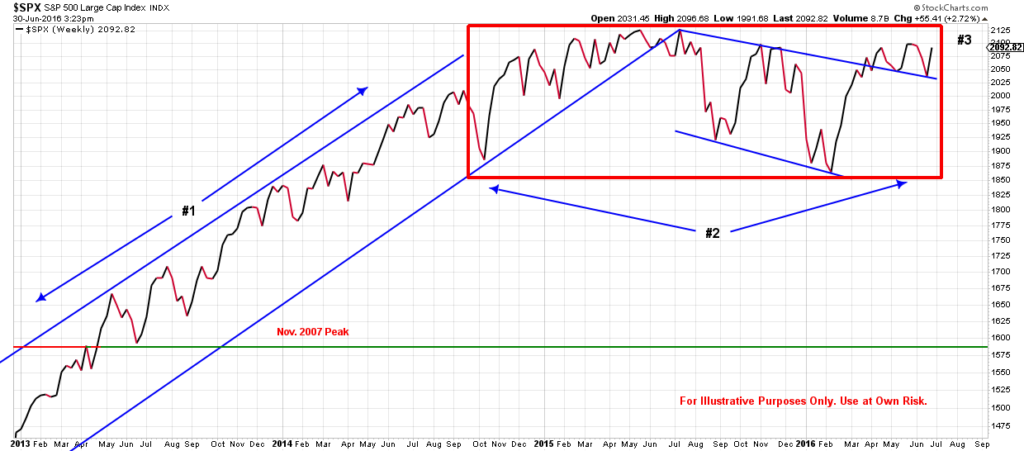
In order to step back and take a longer-term view of the markets, it helps to look at the weekly charts from the S&P 500 and compare different historical time frames.
Examine the first chart below. The first thing to notice (indicated by #1) is the upward trend from January 2013 through late 2014. (Dates are at bottom of the chart.) Notice that the market has stayed in the same range from early 2015 to today. Or for the last year and a half (indicated by #2). In order for the S&P 500 to make progress and break through the current sideways trading range, it needs to move upward through the 2100 – 2130 levels (#3). So far this year, it has approached those levels twice, but has been unable to climb through.
Now take a look at the next chart from 2001 to 2012. It is similar to the first chart in that, for almost two years, the S&P 500 stayed in the same trading range. It did advance a little more in 2012 over 2011 but not appreciably and not without heavy volatility. It wasn’t until 2013 that the markets climbed and went above the last peak from October of 2007.
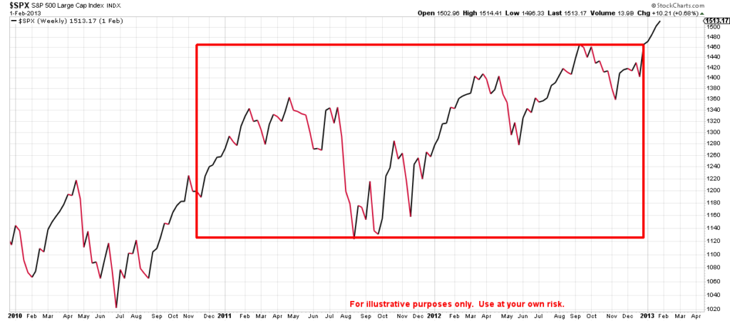
The point of this comparison is to remind you to be patient. Moving sideways for extended periods of time can be frustrating and has caused many investors to make bad decisions. Usually right before the next big move up.