As we pull closer to the end of this election season (Ugh), I’ve gotten a few questions about the impact it could have, if any, on the stock market. Historically elections don’t have much of a long term impact on the price levels of the major indexes. The election of a particular politician might affect some individual stocks from time to time, but not usually the big picture of the stock market. Trend changes in the markets that seem to have occurred around the time of an election have usually already started earlier but the media and politicians begin talking about it more frequently in order to use it to their advantage so the perception of timing can be skewed. There are some better ways to see if these trend changes are taking place by looking at simple moving averages.
One of the best ways to see trends in the market is to remove the day to day price fluctuations from a chart and look at the relationship of a few moving averages of a market index. I have inserted some charts of the S&P 500 below to illustrate this concept.
The first chart is from 2000 to 2003 when we experienced a bear market brought on by the dot-com bust. Within the chart, Box # 1 shows the downward crossover of the 50 day moving average (blue line) and the 200 day moving average (red Line) that occurred in November of 2000.
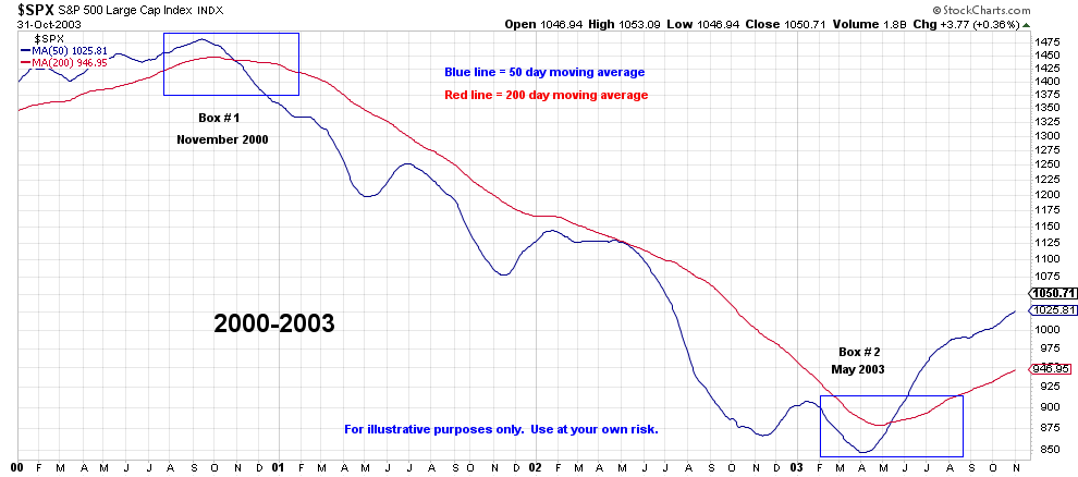
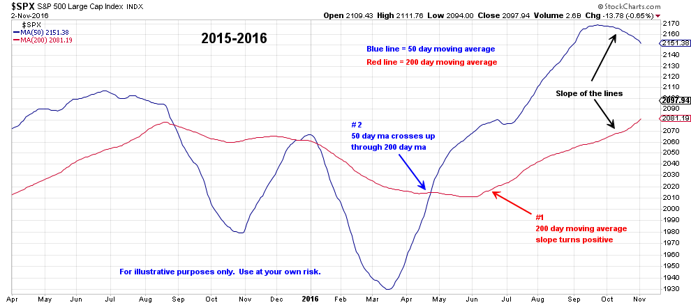
The blue line stays below the red line until May 2003 (Box #2) when the 50 day crosses up through the 200 day and the slopes of both lines turn positive as well. In comparison to today, observe in the 2016 chart below, two positive things have happened that never occurred during the dot-com bear market: (#1) the slope of the S&P 500’s 200-day turned back up in a positive manner, and (#2) the 50-day crossed back above the 200-day. From a trend perspective, this is one of many factors that can confirm trend direction.
Now let’s compare the chart below from the 2008-2009 financial crisis with the previous 2000-2003 chart. A similar pattern can be observed from both time frames that begins in Box #1 with the 50 day crossing under the 200 day and staying there until June of 2009 (Box #2). Soon after the June crossover, the 200 day begins to slope positively again.
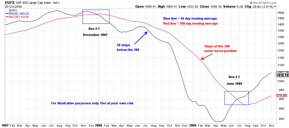
Also notice that during the 2001 dot-com bust and the 2007 financial crisis, the 50 day never recaptures the 200 day and the slope of the 200 day never turns positive. Contrast that with the 2015-2016 chart which has had several 50/200 day crossovers in both directions and the 200 day slope turning positive several times.
What do these charts tell us?
No chart can predict the future, but they can help us determine the probability that good things are happening versus bad things happening. Currently both of these moving averages are in much better position than late 2000 or early 2008 and are currently trending positive which can help confirm a positive longer term trend direction for the S&P 500. Currently the 50 day is near all time highs but does have a downward slope to it which is something to watch in the coming weeks. But the probabilities of the market continuing to trend higher are much better than they were in late 2000 or early 2008.
Of course these conditions could deteriorate in the future, but that has not happened yet. Therefore we will keep a positive outlook in the coming months regardless of the outcome of the coming elections.