I closed my last post by writing that I thought there was more evidence to show that we have moved out of a long-term consolidation phase and into a long-term uptrend. Today we will look at information that supports that idea by first looking at The Value Line Geometric Composite Index. If you are not familiar with it, then here is a short explanation.
The Value Line Geometric Composite Index is an index that was launched on June 30, 1961 by the company Value Line, Inc. which is a highly respected investment research firm. This index contains around 1700 US stocks and was created to provide “a broad representation of the US equity market”. Investopedia defines the calculation of the index this way:
The daily price change of the Value Line Geometric Composite Index is found by multiplying the ratio of each stock’s closing price to its previous closing price, and raising that result to the reciprocal of the total number of stocks. https://www.investopedia.com/terms/v/valuelineindex.asp
This index has 1700 stocks within it, is equally weighted, and is calculated geometrically rather than arithmetically so it tracks the median move of stocks within it, assuming that each stock has an equal amount invested in it ($1 in each stock), thus it is equally weighted. As opposed to a cap weighted index like the S&P 500. This means stocks in the S&P 500 are weighted by their cap size ($) meaning the 50 heaviest weighted stocks could push the index higher while the other 450 stocks lost value. So, what does this mean and why is it important?
By looking at the equally weighted Value Line Geometric Composite Index it can help determine if an uptrend or a downtrend is being led by a few stocks or is the trend indicative of all the stocks in the index. A trend being led by the total market gives us a much better idea of how the market and the economy are performing as a whole and gives us more confidence in a particular investing strategy. Below is a monthly chart of The Value Line Geometric Composite Index going back 28 years to 1990.
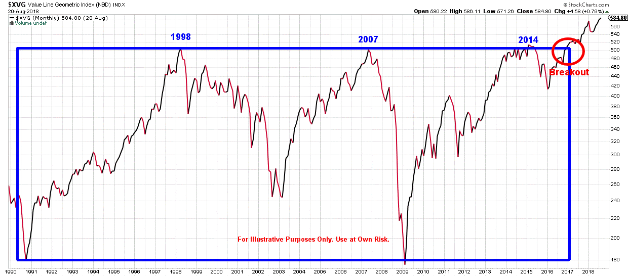
This index topped out in 1998, 2007, and 2014 at very similar levels of resistance until it broke out of its box in late 2016. So, it can certainly be argued that this long-term uptrend is being led by the market as a whole and not just a few stocks or a few sectors.
So, if we ask ourselves the question, “Do I want to be long or short in this market?”, the evidence here indicates we want to be long. But just to confirm our answer let’s look at one more chart that compares the S&P 500 to an exchange traded fund that operates inversely to the S&P 500 which is ProShares Inverse S&P 500 (Ticker symbol: SH). When the two funds are combined in the chart they create a ratio that will lean towards one fund or the other.
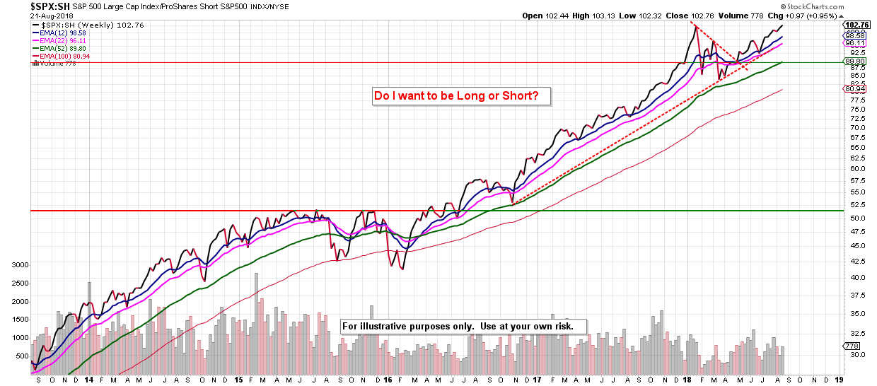
The price line and all of the moving average lines are trending up currently which points to the S&P 500 index being stronger than the inverse fund and tells us we want to be invested in equities.
My biggest concern right now is the bond market. The Federal Reserve has begun raising rates and this will have a negative effect on the value of the bonds in the market right now. I will follow up this post later this week with more on the bond market.
Thank you for reading.