Christmas Scrooge
As you might be aware, the Fed raised rates .25% yesterday just as they said they would. They also hinted that they would raise rates again in 2019 at least two more times. The market was hoping for something a little more dovish and when that didn’t happen the selling began. In the short term, the market has been moving down for several weeks in anticipation of the rate hike, but apparently there was still some hope that the Fed would hold off on any rate hikes.
As we head into the Christmas week, volume in the markets should decrease so any moves in either direction should not have a lot of strength behind them. It was pointed out to me that workers can take four vacation days through New Year’s (1/2 day on 12/24 and 12/31 plus Wednesday through Friday) and essentially be off work for 11 days. Thus, there is a lack of attention paid to the markets which leads to lower volume.
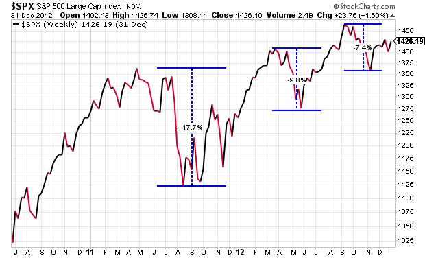
While the current correction is uncomfortable, it is a normal characteristic of markets. Not all corrections lead to bear markets and this can be illustrated in the chart below form 2011. In the summer of 2011 there was a 17% to 18% drop in the S&P that then bounced back by the end of the year only to be followed by a 10% drop in the spring of 2012, another recovery, finally a 7.5% dip in the fall. Being less than 4 years out from a major recession, nerves were a little frayed at that time. Yet the S&P continued to stay in an uptrend.
On the other side of the coin, it’s helpful to look at the state of the market right before the market became bearish in 2000 and 2008 to see if there are any similarities to today’s market. The chart below reflects the yield in US Government 10-Year Treasury Bonds from the year 2000 to today. The lower chart is the S&P 500 during the same time frame on a monthly basis. While yields have been trending down for a long time, when they reach the top of the trend line at the point labeled “A” in 2000 they begin to retreat. Within the same year, the S&P begins a major downturn that ends 45% lower. At the point labeled “B” in the summer of 2007 the yield bounces down off the trend line again. The S&P then peaks by the end of the year and the 55% drop commences.
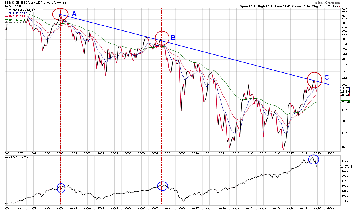
Currently the market is at the point labeled “C”, and the 10-year yield has moved down off the trend line again. Does this mean the market is headed for another crash? Maybe and maybe not. In 2000 we were staring at the dot com bust and in 2008 there was a double dose of a housing crisis and a financial crisis. Currently there doesn’t seem to be a major crisis looming.
It’s also possible that there is some good economic news right around the corner that causes the market to react positively and resume its uptrend deep into 2019. Interest rates are still low along with unemployment and higher wages so it might not take much good news to affect the markets positively.
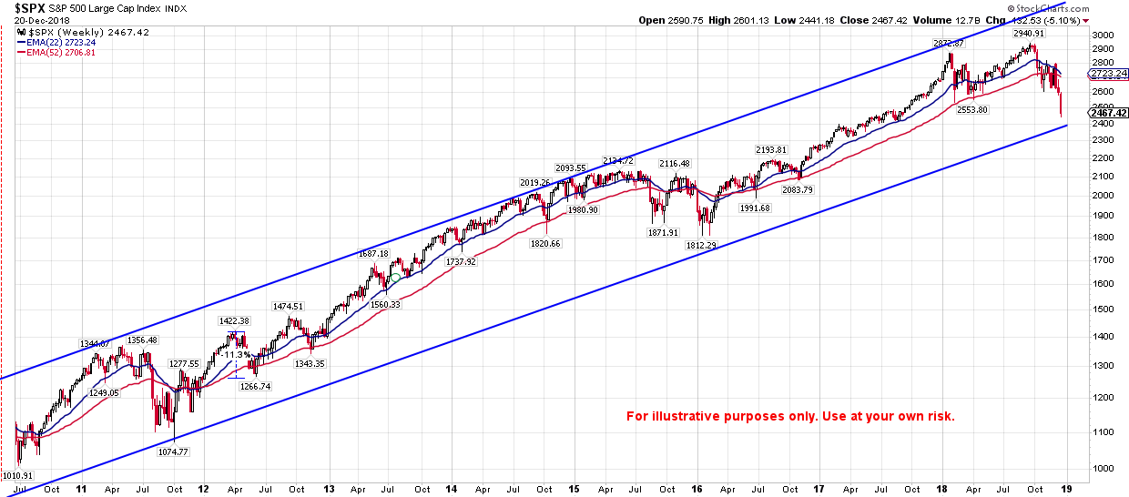
The final chart below gives a long term look at the S&P 500. The price is still within the blue lines that reflect trend channel and the blue moving average line is still above the red moving average line which are both positive indicators. In 2015 these lines came close to crossing, but never did and the market bounced up. In 2016 the two lines did cross and the market made a lower low.
I’m not sure if there is any structural flaw in the economy right now or if we are just simply coming to the end of a typical business cycle and the markets are losing steam, but it’s important to have this type of information when making decisions. My intent is not to make any forecasts here either positive or negative, but to point out areas of concern that we need to be aware of in order to make informed decisions. While the changes in the markets the last several weeks have been concerning and increase the probabilities of a continued correction, we haven’t moved into a bear market yet in my opinion.
This post is written to describe our approach to evaluating markets in more generic terms. It is provide to help readers understand basic concepts and not any specific strategy.