This post is a little more technical than usual, so I apologize if it’s kind of nerdy.
Using the S&P 500 as a proxy for the stock market, we can see that the price has bounced off the December lows very well.
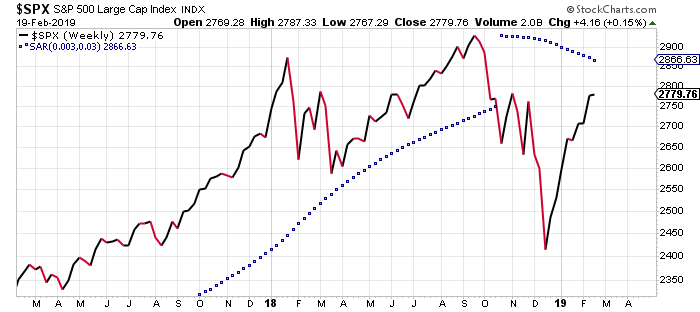
It still has some work to do before it starts making new highs again, but the question, is how much more work needs to happen? Historically, market corrections similar to what happened in the last quarter of 2018 do not just immediately return to making new highs. The last correction that would be similar to this one happened in 2011. The low at that time occurred in August 2011, and new highs were not made again for five-six months. At that time there was just not enough price momentum for the S&P 500 to make a quick turnaround. Currently we are not even two months removed from the bottom of the last correction. Still, that does not mean the S&P 500 will repeat the same pattern in 2019, but it would be unusual for it not to test its lows again.
So, a good question to ask right now is, “how much momentum does the price of the S&P 500 have currently?” One way to answer that question is to use a technical indicator called a Percentage Price Oscillator (PPO). The PPO is a momentum oscillator that measures the difference between two moving averages as a percentage of the larger moving average. This indicator helps us determine whether market momentum is also gaining strength while prices are going higher.
Below is a chart of the 2011 S&P 500 with the price in the upper part of the chart and the PPO directly below it. The PPO has a black and a red line. These lines are also set on a scale with zero being the midpoint. Note that the black line reacts faster than the red line to price changes.
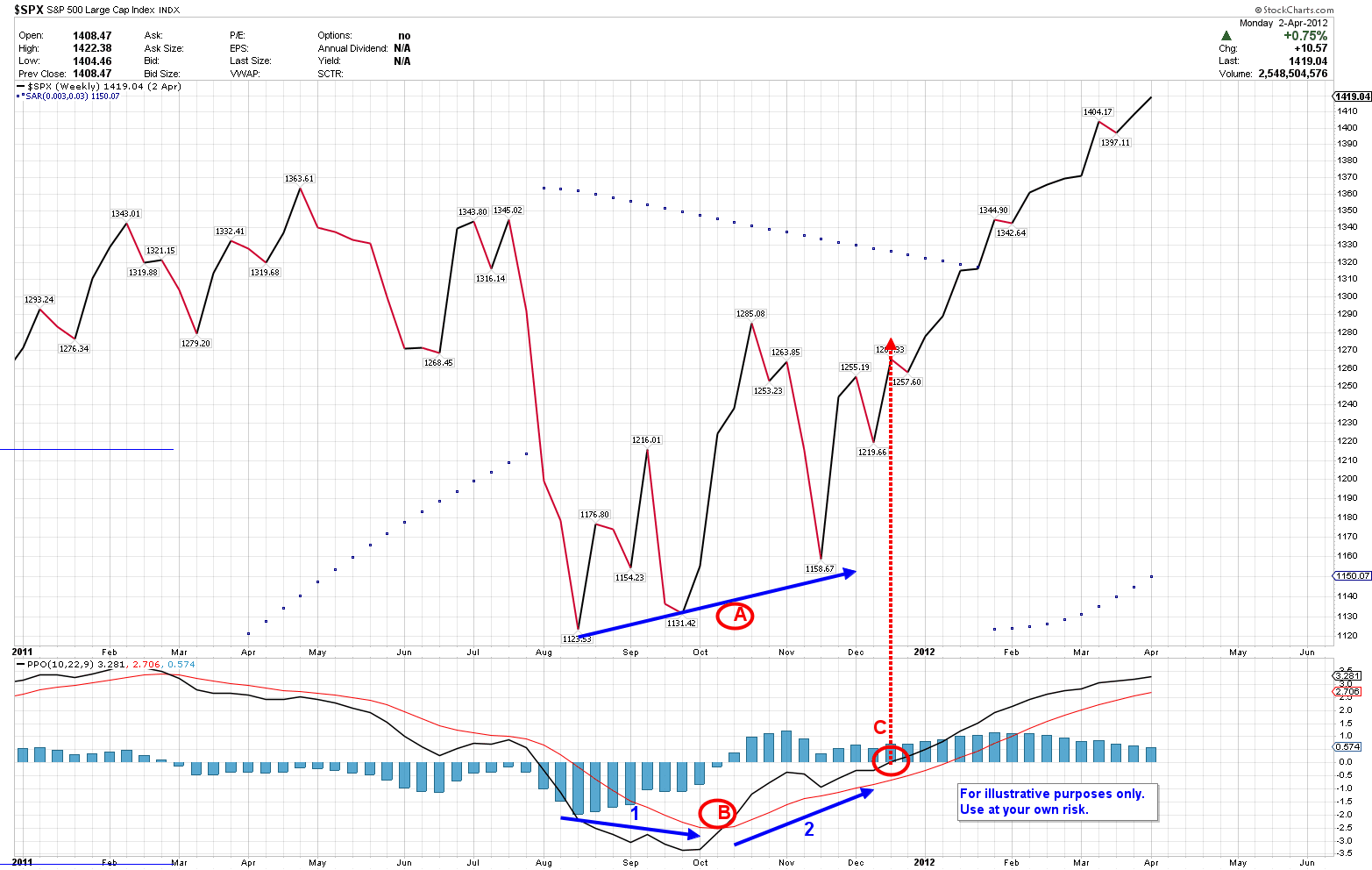
At Point A on the S&P 500 chart, there are three different lows along the blue trend line. Each low is higher than the previous one, and there are higher highs as well. At Point B on the PPO chart, there are two blue lines with the one on the left (No. 1) moving downward (downward momentum) with the black and red PPO lines. You can see the one on the right (No. 2) is moving upwards (upward momentum) with the same lines. This means that, up until late September 2011, the momentum was still negative while the S&P 500 was testing its lows while still making higher lows and higher highs. By the middle of November 2011, momentum had shifted upwards (No. 2) when the S&P 500 made an even higher low. In the middle of December at Point C, the black PPO line crossed over the midpoint line into positive territory, and the price of the S&P 500 began a strong push higher into 2012. So, even though the S&P 500 price was improving in the fall of 2011, the momentum was still negative, which was a signal to remain cautious. Not until the momentum shifted positive—late in 2011—were investors able to take a more aggressive approach. This is the type of scenario that is more typical after a market correction.
Now look at the same chart of the S&P 500 in the current time frame below.
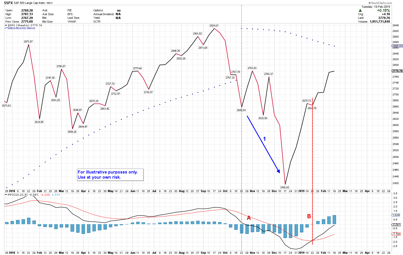
At Point A the black PPO line crossed down through zero, and the price made two more lower lows (No. 1) in the following months. By mid-January 2019 at Point B, the black PPO line had crossed up through the red PPO line and was quickly approaching the midpoint line, indicating greater upward price momentum was building then. And we have continued to see it build. This is a more unusual scenario that bears watching in the coming days. While the typical school of thought says that the S&P 500 will test its lows again, the probability of that not happening is getting stronger.
If you have any questions, please don’t hesitate to contact me.